
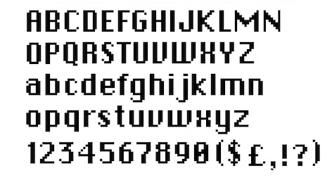
My career in user interface graphic design began when I worked for Apple Computer between 1983 and 1986. My job: icon and font designer for a new computer, the Macintosh. The task: to transform small grids of black and white pixels into a family of symbols that would assist people in operating the computer. The design process involved the search for the strongest metaphors, and the craft of depicting them. My work also focused on developing a set of proportional typefaces for the computer screen; a departure from the monospaced characters typically found on typewriters and earlier computers. With the icon and font work, I hoped to help counter the stereotypical image of computers as cold and intimidating.
My work has continued to be motivated by respect for, and empathy with, users of software. I believe that good icons are more akin to road signs rather than illustrations, and ideally should present an idea in a clear, concise, and memorable way. I try to optimize for clarity and simplicity even as palette and resolution options have increased. I rely on common sense; when I designed buttons, icons, and other screen images for Microsoft's Windows 3.0 in 1987, I was able to use the 16-color palette to replace black rectangles with images that looked like three-dimensional "pressable" buttons. I was also challenged to fine tune many images for applications by using dithered patterns of color to offset the constraints of the limited VGA palette.
Design Hero

Happy MAC
Typeface